Let me preface this post with the admission that I am not a professionally trained web designer. I have had experience designing web-based learning materials and have knowledge and exposure to Usability and User Experience (UX). Some of the past organizations I have worked for held UX as a primary goal in producing good products. I am still very committed to learning how to provide the most user-friendly solutions to the content I deliver. Happier users are more productive workers.
DESIGN QUESTIONS:
- Should website links to external sites open in new windows?
- If so, how do you differentiate links on a site to external pages to links that point back (internally) to the site?
I wanted to do some research on the questions above to help provide answers but also to solve a problem I am facing with a website I have inherited. This site, which I vaguely referenced this site in a previous post, needs a major overhaul starting with a card sort, but the immediate need is to update some of the more visited pages with current information.
The site was created as a hub to connect learners with other content both within and outside of the site. Therefore,the site is linked to both internal and external resources and each page has multiple links. Sometimes dozens of links.* Returning to the two questions above, I found the camp somewhat divided on opening in a new browser:
| YES, open in a new window |
|
|
| NO, do NOT open in a new window |
|
|
After reading the advice and developer discussions on the sites above as well as additional resources, I’ve come to the conclusion that I will continue to keep external pointing links pointed to opening in new browsers, because they are reference to content outside of our own. I’m also leaning to proposal #1 below to help guide or teach users where to go.
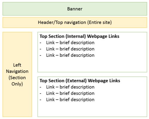
My proposed solutions to fixing the page content would be as follows:
- Train users where to expect internal pointing links vs. external pointing links. If possible keep the internal pointing links together in 1 section at the top of the page. Links that point to an external site are kept in a second section. There are no explicit instructions that warn users, but eventually repeat users learn that anything they click at the top of the page points to the same site, but links on the bottom half are external links. They start to expect the behavior.
- Give the users a choice. Have the current link open in the same browser, but provide an icon that allows them to open in a new browser. While this seems like the politest option, from a web developers perspective it is the most labor intensive. Also, it will me you will have to update links in two places.
Proposed temporary solution to web page design.
* I have to resist the desire to say that such hub sites are NOT helpful to users because their architecture is often not based on personal user experiences.


You must be logged in to post a comment.