Dev Learn 2015 – Day 2 and Final Reflections

Social hub at DevLearn

Social hub at DevLearn

Apologies that this took me a few days to finish. In the spirit of creating an interactive infographic, I developed one that has links to the more helpful presentations and resources I found while attending DevLearn 2015. Click on the image  to open the PDF with active links to both .pdf and web resources.

DevLearn Summary Infographic
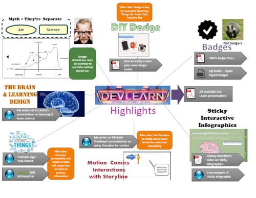
Here’s my summary going clockwise starting at twelve-o-clock. Please note I’m not re-summarizing presentations & ideas I’ve already discussed in previous posts. As always, DevLearn is action packed and full of

Design is Key – successful eLearning design takes into account not only look and feel (intended impact on the audience) as well as good user engagement. Bianca Woods also presented an excellent how to demo on how to easily create your own graphic elements without being an “Art Wiz.”

Badges  – I learned first hand from participating in the badging system for DevLearn using the DL2015 app how competitive I am, and humorously enough, I eventually realized that I wasn’t trying to earn the points to get the swag. I did worry that many people might have been trying to load their points by filling out assessments for sessions they did NOT attend. Oh well. I suppose there’s a way to filter these responses out.

Badges can promote growth and learning by sparking learners’ curiousity, competiveness, or providing them with a tangible way to track their progress. Most importantly, they can offer “automated assessment tools” and “learning data.”

Still, for the execution of a badging strategy to work effectively, trust in the badging system must be built (by using trusted experts, both within and outside). Also, administrators and monitors of the system could effectively be training by having earn badges themselves.

Sticky Infographics – you can create engaging infographics using Storyline, Captivate, Lectora and even simple PowerPoint (publishing a linked and media embedded PowerPoint slide as a PPS or PowerPoint Slideshow).

Internet of Things – touched upon in David Pogue’s keynote, will change how we collect data on ourselves and others and how we learn from it. Some apps collect data that can drive competition (example: fitness & weight loss apps). Others will give us a picture of our own and sometimes our peers behavior over time.

Science and Art are Connected – Through his artfully presented talk, Adam Savage from the Mythbusters showed us how Science and Art have a lot in common and that curiousity sparks and drives achievement and discovery in both.  And Savage’s advice to all learners: Pay attention; speak your mind; stay curious; ask questions; and tell stories/listen to them too.

To view a very good summary of the Savage’s keynote, view Cammy Bean’s Live Blog Notes.

Day 1 Reflections – DevLearn 2015

Ideas for designing next learning experience:

Years ago I had a simple idea: happy learners are those who get what they need to feel accomplished in their tasks.  Depending on your field or business, successful learners are accomplishments and milestones or happy and loyal customers.

So many training efforts focus on wowing learners during the training. 24 hours later, you can ask those same learners what  they learned and they will have forgotten most of it. According to Kohn apparently 70% of all training is forgotten after a day. What does this mean for your strategy for creating happy learners/customers?

You need to focus on what is done after the training.

According to Art Kohn’s presentation, this can be accomplished by meeting the needs of the 3 part recommendation of activity that focuses on what happens after the training  (see the image below). One example Kohn highlights as part of their business solution is providing learning boosts to training participants which are brief questions, quizzes or polls around the content. Another example includes using social reinforcement in the form of competitive games with learners (badge earning, accomplishment lists).

If you don’t “use it (within 24 hours), you lose it.” Therefore, it’s in our best interests to get our learner/customers to commit to applying what they’ve learned and give them incentive to do so. This incentive or reward could possibly take different forms according to the audience’s needs/desires:

  • a gift or tchothcke if they share their story/testimonial of putting what they’ve learned into practice within 2 days
  • the opportunity to win a larger substantial prize if they can provide proof that they’ve applied the knowledge/skill post-training
  • simply the opportunity to receive recognition for their accomplishment
  • competing with their peers to earn achievement badges for what they’ve applied at work
  • a warning that inability to put the training in action afterwards may put their work, business, standing, safety, or customers at risk
  • even more examples…
A Kohn's Pyramid

Click the image for a larger view

Cammy Bean pointed out designers of learning experiences should avoid overusing the clickity clackity and bling, bling where it’s NOT necessary.  Bad Computer Based Training (CBT) is usually pretty flat and is mainly a content dump.  Instead it should address the following questions the right way.

How does it make you feel? –> Does it appeal to or touch upon the appropriate emotions to get your attention?

How does it look? –> Is it aesthetically pleasing and easy to read?

Do you know what to do with it? –> Can the learners just pick it up and learn without 5 pages of orientation and instruction? Is it intuitive?

I would add the following question because, as Cammy pointed out, so many people are still resorting to creating page turners (or even content dumps in the form of webinars, which seem to be the bandaid training in many corporate and business environments).

Are you just resorting to dumping content? –> Have you created a simple page turner? Or are you engaging your learners and providing opportunities for them to reinforce their learning?

I think going forward I’m going to use these questions very similarly to the questions I use in the empathy map I explained in a previous blog post. They can act as reflective and evaluative questions of my own training strategy and design to insure that my learners are the winners.

Dumptruck Bottle cap with

An interesting factoid I learned:

The average age of a user on Twitter is 35 and their income is $75K.

A while ago I also read somewhere that Twitter users are the introverts of the net while Facebookers are the extroverts. Honestly, that sounds about as real as a “Which Game of Thrones Character Are You?” quiz.  I don’t use facebook, but as a skeptical introvert, even I take what I’m saying with a grain of salt. Here is an interesting post from Fast Company that argues that introverts make the best networkers on Twitter.

And about using badges…

I like the idea, but as I discussed in my Twitter conversation with @pascalliberte on badges, as a somewhat competitive learner. I like the idea of tracking my progress in learning with milestones and badges. I also might make an effort to be the first to finish tasks. However, I can empathize with those who might feel like badges are as patronizing as using stars and stickers to motivate adults to learn. The use of badges and leaderboards must be done appropriately for the learner audience.

Images from the Morguefile:
http://www.morguefile.com/archive/display/95045
http://www.morguefile.com/archive/display/864730

Accidental Instructional Designer – with Cammy Bean

STICKY IDEA: Clickly clicky bling bling is NOT what we want to do with our eLearning. Choose wisely.

Ppt.  of Cammy’s presentation is here:

http://www.elearningguild.com/assets/files/56/dl15_305_bean.pdf

All DevLearn .pdfs available are here:

http://www.elearningguild.com/DevLearn/sessions/resources.cfm?selection=doc.4027&event=380

My live infographic from the session:

Infographic on Cammy Bean Lecture

My key take aways from this session: 

1.) It’s important to consider the big picture for developing good training content (Consider the 4 areas: Creative, Business, Technology, Learning (Pedagogy).

2.) Many eLearnings that fail don’t consider the importance of good design. Design must have a purpose.

3.) This is a great outline for how eLearning content should flow:

Skillbuilder format

4.) Here’s a great example of design that engages emotionally – we think about how gross this is. The images help tell the story and spark and emotional response. The questions are meaningfully written and designed to provoke thought, and it’s intuitive and easy for the user to use!

Example of good simple eLearning Design

Brain Science & Learning: 7 Tips that Will Dramatically Improve Your Learning

SESSION: Brain Science & Learning: 7 Tips that Will Dramatically Improve Your Learning

Presenter: Art Kohn

Will update this post with a deeper reflection later. Learned so much even though I just jumped in this session

7 Tips Shared:

  • Delivery of Knowledge Bursts
  • Cognitive Boosting
  • Gamification
  • Pre and Post-Assessment
  • Coaching
  • Social Learning – Harvesting best practices
  • Gamification

During the session I created an infographic to support my learning (and remembering ;)).

BrainScienceLearning

Optimal Duration of Learning Boosts:

Received Boosts of 5 seconds –> 5 minutes… got the same levels of retention.

Boosting is not reteaching.

What you do after training is important to increase retention.

I want BOOSTER TRAINING FOR THIS LECTURE! So I left my card with my contact info at Prof. Kohn’s table 🙂

Additional Resources:

Using Comicbook Format in Storyline

Pow (comic text)

SESSION: Story Hero: Create Comics and  Motion  Comics  Interactions with Storyline

PRESENTER: Michael Sheyahshe

Remember to become aware…How we read comic books

Comicbook style interactions, using animations. Place more emphasis on the story.

Comics: create interest, focuses on story points.  Visually communicate ideas and grab your attention.

What Panels do….

Allow you to storyboard content.

  • Reference – Scott McCloud’s icons hierarchy.

http://blog.visualmotive.com/2009/understanding-comics-with-scott-mccloud/

Scot McCloud visual hierarchy

  • Comics –> Distance = Time.
  • Closer = less time.
  • Tripping the Z-axis. Translation perceived depth. Simple example = shadow.

Comixology is a great app. Provides examples of how to execute.

https://www.comixology.com/

Execution recommendations:

  • Keep animation simple. Simple line motion animation can provide a  powerful effect. Remember distance = time.
  • Create your comic layout/ and fill out the panels. Similar to how Prezi works with the zoom feature.
  • Cool – can embed videos in a panel!
  • Put panels on separate layers.
  • Pause each panel and place the timing on the timeline for the layer/panel.
  • You  can add a motion path.
  • Add click interactivity to view next panel or layers. BRILLIANT!!!

Speaker Sheyahshe <YouTube? Channel>

Articulate comic Example

Possible other resources:

Articulate article – Comic style designs in Courses

https://community.articulate.com/discussions/building-better-courses/comic-style-designs-in-courses

Revving up for Dev Learn 2015

MGM Casino

MGM Casino near walkway to NY NY – My colleague and I have had to send each other photos of our location to find each other. “Which Starbucks are you at?”

The last time I was at MGM Grand Hotel was in the 80’s as a child, I remember riding the elevator with the comedy legend Dom Deluise. Today, this hotel seems even more massive and maze-like. I am trying very hard not to get overwhelmed by the Casino environment. Only my first day here at Dev Learn 2015, and my colleague and I have had to text pictures to each other to locate each other. We made the mistake of agreeing to meet by the Starbucks, and of course there are three in the hotel. I finally took a photo of the hotel map and drew a path to the conference area! But I may have to make visual breadcrumbs/associations still to mark my path.

Map for Sanity

Topics of interest at Dev Learn 2015 – Day 1 (Wednesday, Sept. 30)

Can you imagine these are just the topics of interest for me on the first day only:

  • We Don’t Own Social in the Workplace
  • Mobile Learning Innovations
  • How Caterpillar Uses Bite-sized Learning to Close the Skills Gap
  • Navigating Today’s Learning Metaverse
  • Story Hero: Create Comics and Motion Comics Interactions with Storyline
  • Unpacking Badge Analytics: What Metadata Can Tell Us
  • Fast, Easy and  Cheap:  How to Use WordPress as a LMS
  • Everyone Everywhere: How to Create and Deploy Multi-device Learning Content
  • Building Bite-sized Learning in a Traditional Training World
  • Microlearning Video on a Shoestring
  • Digital Badges and the Future of Learning
  • And… just because of the title… Where to Look for the Purple Squirrel

Speaking of Rodents, with all the candy, toffee apples, cupcakes, fatty breads, high living and gluttony-inducing things around me… I couldn’t help but think that Templeton the Rat would have a great time here… at least in the dumpsters.

Usability Back to Basics: Should Links Open in New Windows?

Let me preface this post with the admission that I am not a professionally trained web designer. I have had experience designing web-based learning materials and have knowledge and exposure to Usability and User Experience (UX). Some of the past organizations I have worked for held UX as a primary goal in producing good products. I am still very committed to learning how to provide the most user-friendly solutions to the content I deliver. Happier users are more productive workers.

DESIGN QUESTIONS:

  1. Should website links to external sites open in new windows?
  2. If so, how do you differentiate links on a site to external pages to links that point back (internally) to the site?

I wanted to do some research on the questions above to help provide answers but also to solve a problem I am facing with a website I have inherited. This site, which I vaguely referenced this site in a previous post, needs a major overhaul starting with a card sort, but the immediate need is to update some of the more visited pages with current information.

The site was created as a hub to connect learners with other content both within and outside of the site. Therefore,the site is linked to both internal and external resources and each page has multiple links. Sometimes dozens of links.*  Returning to the two questions above, I found the camp somewhat divided on opening in a new browser:


YES, open in a new window


NO, do NOT open in a new window

After reading the advice and developer discussions on the sites above as well as additional resources, I’ve come to the conclusion that I will continue to keep external pointing links pointed to opening in new browsers, because they are reference to content outside of our own.  I’m also leaning to proposal #1 below to help guide or teach users where to go.

My proposed solutions to fixing the page content would be as follows:

  1. Train users where to expect internal pointing links vs. external pointing links. If possible keep the internal pointing links together in 1 section at the top of the page. Links that point to an external site are kept in a second section. There are no explicit instructions that warn users, but eventually repeat users learn that anything they click at the top of the page points to the same site, but links on the bottom half are external links. They start to expect the behavior.
  2. Give the users a choice. Have the current link open in the same browser, but provide an icon that allows them to open in a new browser. While this seems like the politest option, from a web developers perspective it is the most labor intensive. Also, it will me you will have to update links in two places.
Proposed temporary solution to web page design.

Proposed temporary solution to web page design.

* I have to resist the desire to say that such hub sites are NOT helpful  to users because their architecture is often not based on personal user experiences.


Empathy map: An excellent tool for planning change or any other initiative

I recently read through IDEO’s Tom & David Kelley’s book Creative Confidenceand I found a great deal of inspiration for helping build buy in for my designs and proposals. I also was able to add to my collaboration tool kit, as the book also presents stories and collaborative processes that can help kick start creativity on any team.

We have all worked on initiatives where we were so rushed that it felt if we built out our case logically and spelled out the benefits to our audience, they would naturally accept the change… or so we thought. But as we’ve found time and time again, “If you build it, they will come” often proves to be one of the most ineffective product launching strategies.

IDEO’s approach to design and change initiatives is a human-centered one that examines potential reactions to any sort of new product, object, service or change. The Empathy Map tool presents a simple start at mapping and envisioning how people will react to what you’re putting in front of them whether it is a user interface to a purchasing tool or an ice-cream scoop.

The Empathy Map asks four questions in regard to your change, product, or initiative:

  1. What will people say?
  2. What will people think?
  3. What will people do?
  4. What will people feel?
Empathy Map Questions

Ask these questions to think out how your audience will receive or react to your initiative or change.

Normally, you would put these questions up on a white board or pieces of chart paper and have your team write their answers to these questions on Post-It notes, but I work in virtual teams, so I created a PowerPoint version (see Resources below). These questions can help you sort through possible reactions and prioritize the ones that you should address. Then start making a plan for how you will address those.

In my example PowerPoint, I included the simple example of sending out a survey. Everyone loves taking surveys right? After listing a few audience reactions, thoughts, and feelings, I made an initial attempt at addressing those that I’ve seen in the past.  What I appreciate about this approach is that is a little more thorough. It allows you to separate and methodically map these reactions vs. coming up with the most ‘scary’ ones and reacting solely to those.

Resources:

Part 2 on herding cats: diving into using Six Hat thinking

Six_Hats_For_Evaluation_Feedback_Session_Agenda_Generic

Six Hats Thinking agenda for feedback

Six Hats Thinking agenda for feedback

Most brainstorming sessions I have participated in frustrate me because it seems that people are so inclined to jump into the part where you solve the problem before you have enough data or information. In an earlier post, I mentioned how useful Edward deBono’s Six Hat Thinking is for herding those proverbial cats in the workplace.  What I really appreciate about the deBono model of facilitation is that it helps bring thoughtful order to collaborative work without forcing participants to use a highly constrictive process. If facilitated smoothly, it allows the group to separate their egos from objective sharing while still giving a voice to intuition and feelings.

Also, most importantly, Six Hat Thinking allows other voices to come into play in discussions other than just those four to five loud ones that typically are most heard the most vocal in many larger group discussions.

Recently, I held a project wrap-up and feedback session built around deBono’s Six Hats. We had a very limited amount of time and we were all pressed to providing meaningful contributions to a discussion after a heavy lunch.   I did find four things most helpful for the discussion’s success.

  • Allow people to gather their thoughts in accordance to the Six Hats thinking model prior to the meeting. I provided an optional worksheet or prompts for the discussion. At least people could frame their thoughts prior to the session rather than feeling as if they had to respond on the spot.
  • Keep the explanation about deBono’s theories and the Six Hats to a minimum while restating the main objective of the feedback session which is to gather information to improve the project management process going forward.
  • Gather the information ahead of time about the project charter (Blue hat thinking) and an initial set of project facts and stats (White hat thinking).
  • Take the colored hats reference out of the agenda but share it later or as part of a handout.

The last piece of advice, I applied last minute to my presentation because I didn’t want to focus primarily on the process of using the hats but on our main objective to gather information to improve our process for future initiatives. The discussion was rushed, however being able to shift between the positive (Yellow hat) and negative aspects (Black hat) of the project before diving into the solution space (Green hat) allowed us come up with a more exhaustive list of areas for improvement.  I was also careful to make sure to include time for the Red hat at the end to express our intuition and emotions about the project because it gave us an opportunity not to achieve some closure, but to express the emotions or thinking that are often pent up during a project as well as to celebrate our feelings of accomplishment and even relief as an end note.

I actually, wished that we had done this more regularly, but upon reflection, if the context and some guidelines (rules) aren’t provided around sharing of emotion and assumptions, discussions might not be as productive as you’d like. This is the part of meeting facilitation that I want to improve at going forward.

You can view the templates and slides I used for my feedback session here:

Slides used (pptx format)

Six_Hats_For_Evaluation_Feedback_Session_Agenda_Generic_Ex

Pre-work template

SixHats_Feedback_Input

Slideshare: Being an excellent but quirky boss means you need to get opinions from the “straight men” on your team

It’s hard for one not to like a show that demonstrates spot on storytelling and character development despite its 30 minute format. It’s hard not to like a show that not only makes you excited about music but inspires you to see connections between art and the realities we live in. This show was just plain fun to watch and it re-affirmed to me the importance of passion and commitment as leadership qualities I admire. Maestro Rodrigo embodied these characteristics, and I spent time examining how and why.

Continue reading ‘Slideshare: Being an excellent but quirky boss means you need to get opinions from the “straight men” on your team’


Why?

My place outside of work to explore and make connections with the ideas and things (sometimes work-related) that I'm passionate about.

Blog Stats

  • 308,951 hits